Rachael Bissig Real Estate
Rachael Bissig is a Santa Barbara Real Estate agent. Her business had grown beyond its original brand, and it needed a makeover. But in a community that knows luxury, the brand needed to really connect with the lifestyle of Santa Barbara: think beautiful beaches, simple yet expensive, refined living.
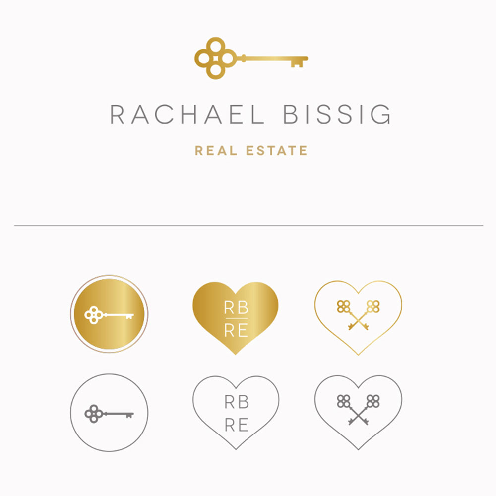
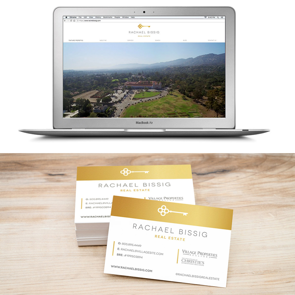
JENCO dove in, intent on staying true to Rachael’s character, while dreaming up the right way to really resonate with the surrounding community. We designed a logo that featured a classic golden key with a touch of fun and elegance. Pairing the logo mark with a rounded, all-caps font, we were able to play nicely with the shape of the key and still keep everything simple and clean. Finally, we augmented the core logo with supporting brand marks that included Rachael’s initials and a heart.
At closing time, the brand makeover captured a strong, feminine tone while being a clear symbol for unlocking a brighter future. Just what Rachael needed to inspire confidence in her clients.
Client
Rachael BissigCategory
branding Print


