Protea Acupuncture
Fresh out of Chinese Medicine school and opening her own practice in the Bay Area, our client needed a ground-up approach to branding her new company. She wanted the brand to reflect her personality, with a touch of Eastern style.
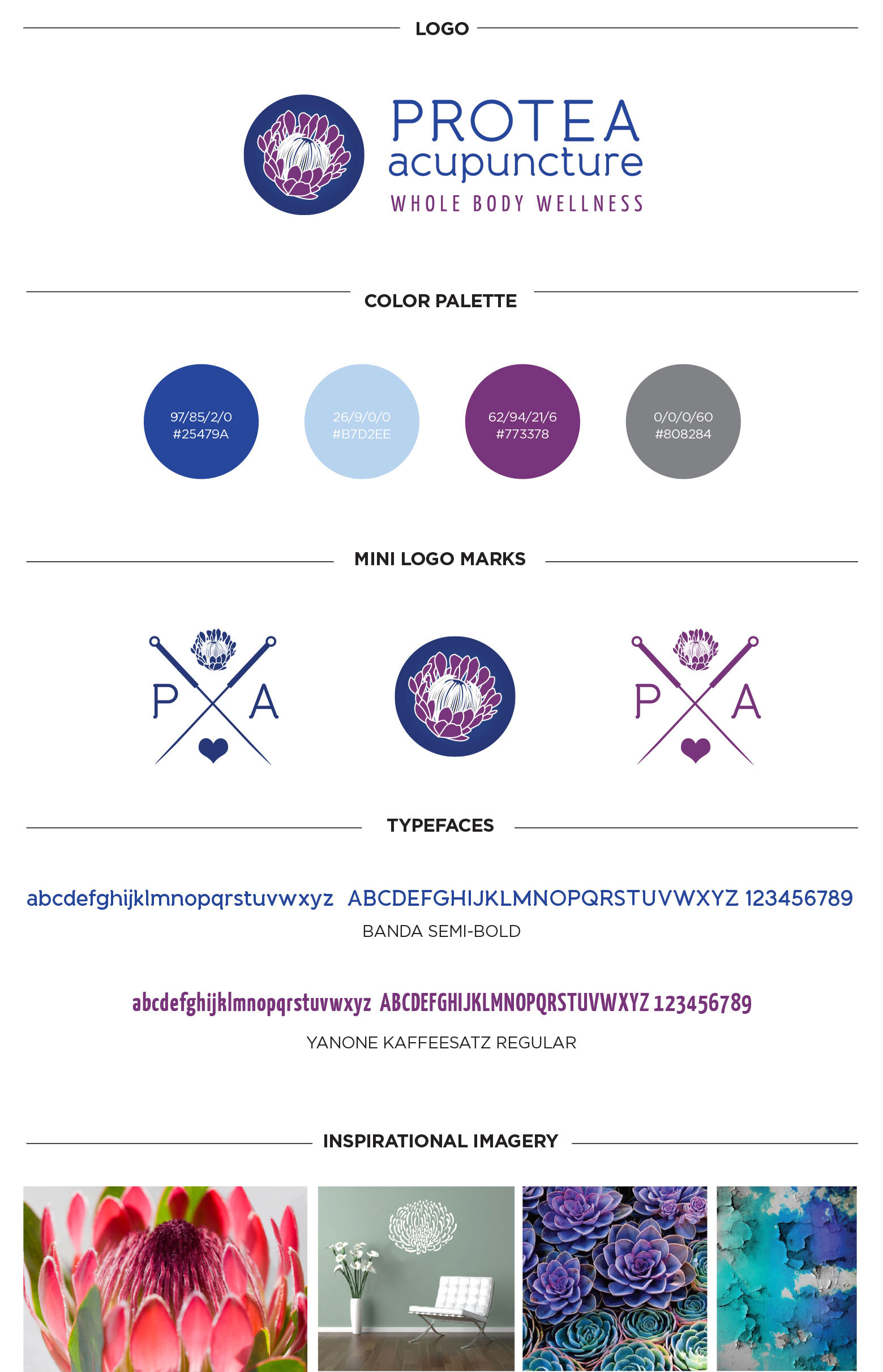
The name Protea Acupuncture was inspired by her favorite flower. We produced a stylized protea flower that combined asymmetry and detailed, natural lines, and we captured in a circle to live as an icon, and incorporated blue and purple palette for a rich, unique look. Pairing the icon with a wordmark that used two serif fonts, the final logo mark is a blend of simple and complex elements working together in harmony.
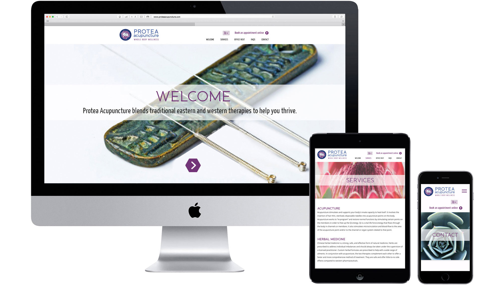
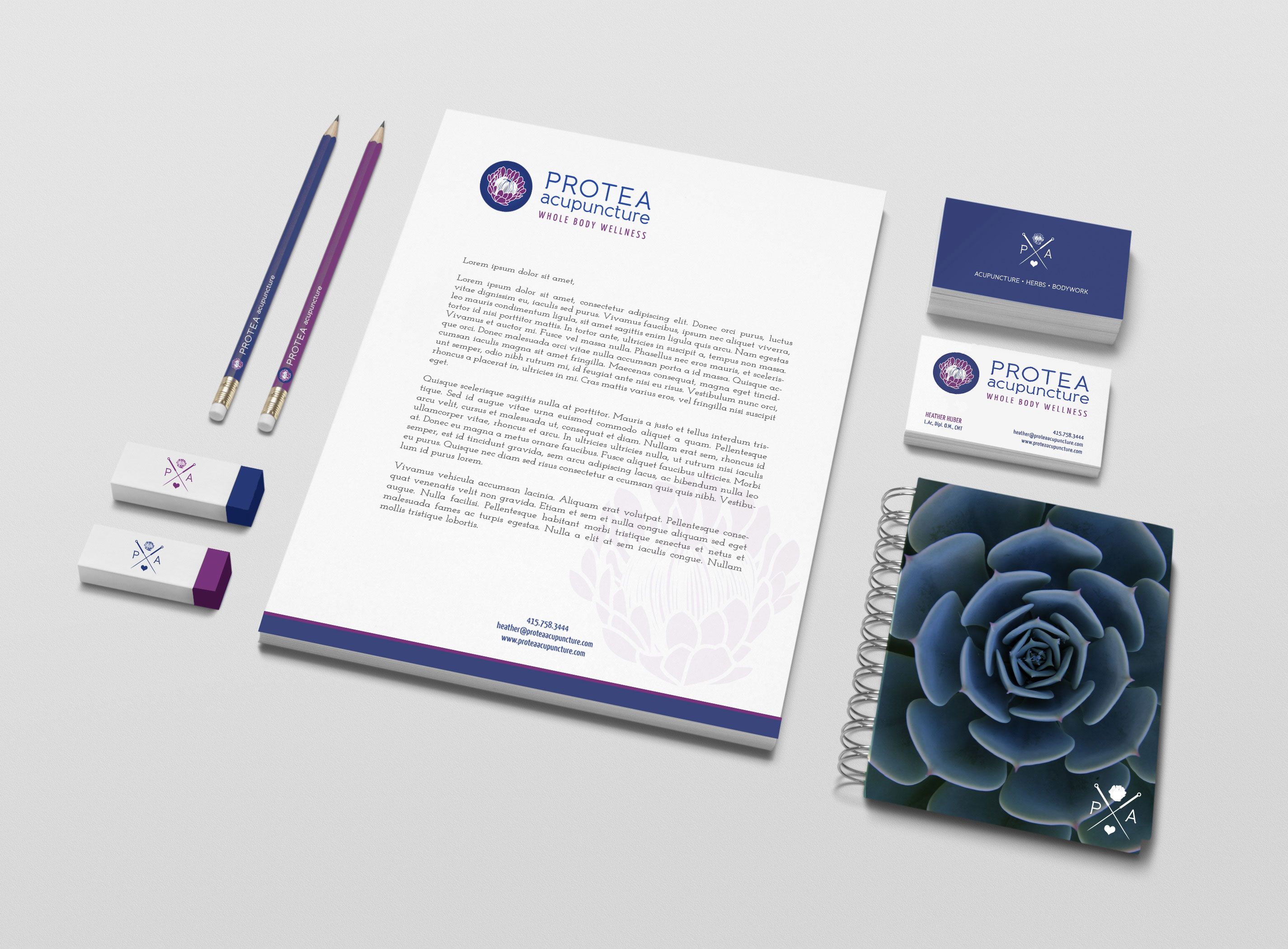
JENCO went on to design and write a scrolling website that felt light while still being very informative. Bringing in beautiful photography, we toed the line between embracing Eastern style while embodying mass appeal. We wrapped up the brand with a suite of cards, gift certificates, notepads, pencils and tote bags, equipping Protea with everything it needed to thrive.
Client
Heather Huber, L.AcCategory
branding Digital Print


