Welcome to Monday! In the last couple of weeks, we’ve featured the colors yellow and spring green in our mood boards. Both colors were very uplifting (something everyone needs right now) and hopefully brought a smile to your faces. This week I had a friend request that we showcase the color violet – which just happens to be his youngest daughter’s name. The first thing I’d like to note about the color violet is that it is not the same as the color purple.
To sum it up simply – violet is a shade that leans towards bluish-purple and feels lighter than the saturated, reddish color of purple. Since violet is a combination of cool and warm colors it inspires the imagination and is a bit introspective. It can also evoke spirituality and calm emotions. While it’s not purple, it does share many of the meanings of the color purple: royalty, nobility, luxury, and extravagance.
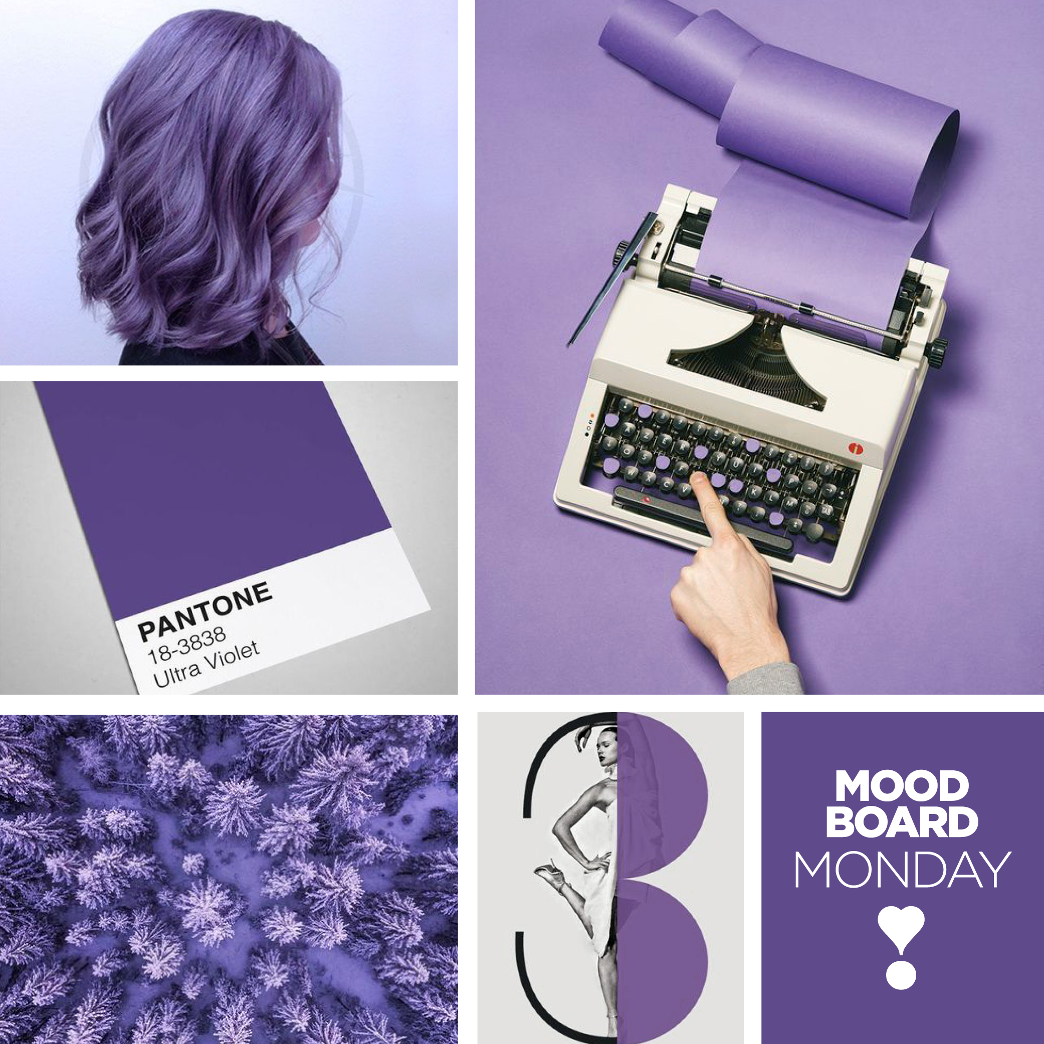
As a designer, I remember when Pantone chose “Ultra Violet” as their color of the year for 2018. A color I don’t pull out of the color wheel often had now become an “on-trend” color and I found it to be interesting to design with. Because violet is both a warm and cool color, you can create different reactions based on the colors you combine with it. Combine violet with pink for a (stereotypically) feminine palette or go (stereotypically) masculine with dark violet, gray, and black.
When it comes to brands and the use of color psychology for their brand logos – the color violet and similar hues are all considered purple. While it’s not the most popular color on the color wheel, choosing purple for your brand has it’s own benefits, such as being a differentiator in an overcrowded marketplace.
A few examples of familiar brands that claim this color – Cadbury chocolate, Monster.com, and Lady Speed Stick. Cadbury Chocolate is know known for its luxurious, almost sensual chocolate candies, so it just makes sense that the color purple is its primary brand color. Monster (a job finder website) uses the color purple to indicate its powerful search engine and success rate. Lady Speed Stick, the feminine deodorant line, uses a lavender color to portray sensuality, mystery, as well as power for women.
In the end, violet is a shade of purple and therefore sits under the purple umbrella in the color wheel. Most people aren’t going to be nitpicking colors so closely, but as a graphic designer, these are the nuances I pay attention to. Have you thought about the color you’re using to represent your company or product? Why was it chosen? And is it relaying the message you’re trying to convey?
I look forward to sharing another Mood Board Monday with you next week. Until then, please take care of yourself, wear your masks and stay inside.